Contour Maps
[1]:
import numpy as np
import pandas as pd
import geopandas as gpd
import matplotlib.pyplot as plt
import mapped
from mapped.density import GeoKernelDensity
mapped.__version__, gpd.__version__
[1]:
('19.12.1', '0.6.2')
Import some random example point data.
[2]:
from mapped.example_data import mad_points
points = mad_points()
points.head()
[2]:
| number | letter | geometry | |
|---|---|---|---|
| 1 | 73.522015 | A | POINT (-9945192.638 5333669.463) |
| 2 | 59.605820 | A | POINT (-9952134.036 5321688.221) |
| 3 | 52.676887 | A | POINT (-9937860.167 5328515.553) |
| 6 | 22.133990 | B | POINT (-9948386.303 5310253.324) |
| 7 | 34.937765 | A | POINT (-9963868.554 5319452.429) |
The class GeoKernelDensity wraps the more generic scikit-learn KernelDensity, providing some simplifying default options and features.
[3]:
from mapped.density import GeoKernelDensity
gkde = GeoKernelDensity(bandwidth=0.00015).fit(points)
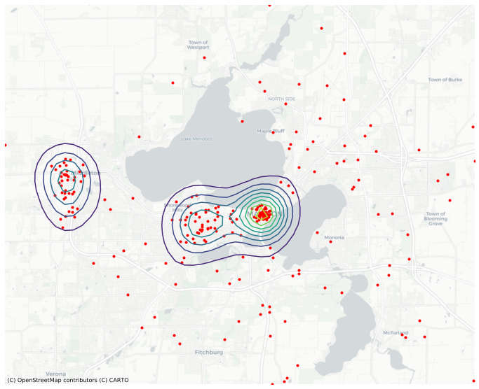
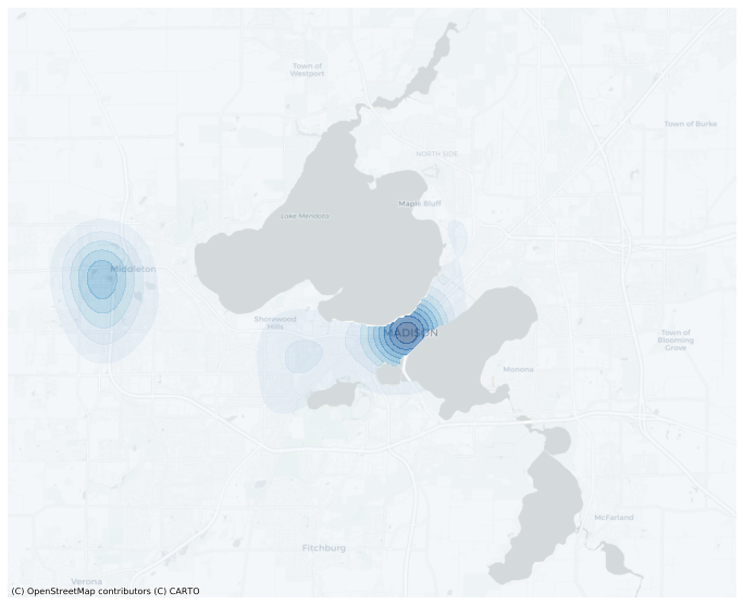
One handy feature is the ability to directly output contour plots.
[4]:
ax = gkde.contour(basemap='CartoDB', figsize=(12,12), levels=10)
points.plot(color='red', marker='.', ax=ax );
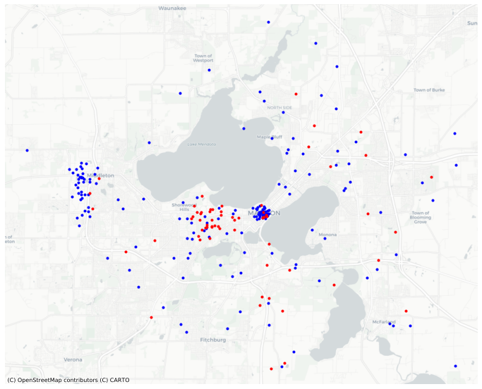
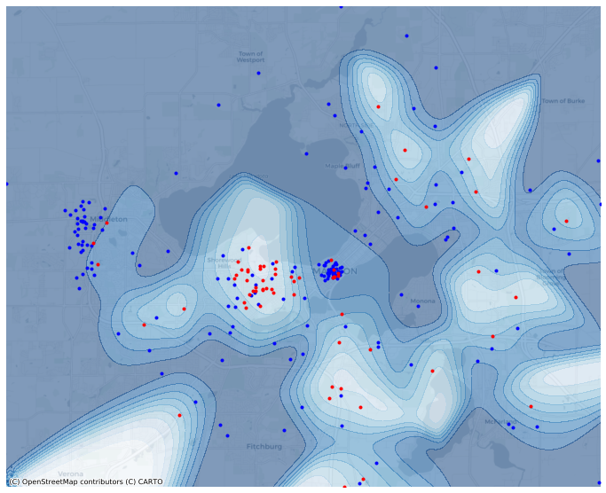
The multifit fits seperate kernel densities on segments of the data defined by groupby.
[5]:
gkde_m = GeoKernelDensity(bandwidth=0.00015).multifit(points, 'letter')
For example, the demo points contain two classes of point, ‘A’ and ‘B’.
[6]:
points.groupby('letter').size()
[6]:
letter
A    174
B     65
dtype: int64
[7]:
ax = points.query("letter=='A'").plot(color='blue', marker='.', basemap='CartoDB', figsize=(12,12))
points.query("letter=='B'").plot(color='red', marker='.', ax=ax );
[8]:
ax = gkde_m['A'].contour(basemap='CartoDB', figsize=(12,12), levels=10, cmap='Blues');
gkde_m['B'].contour(ax=ax, figsize=(12,12), levels=10, cmap='Reds');
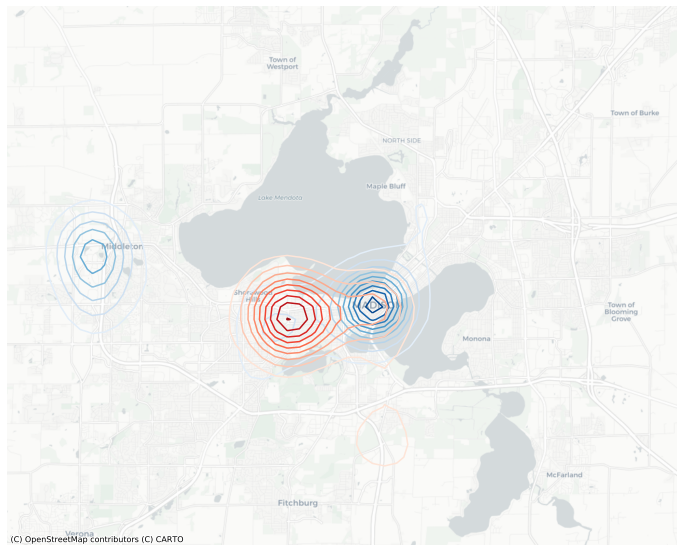
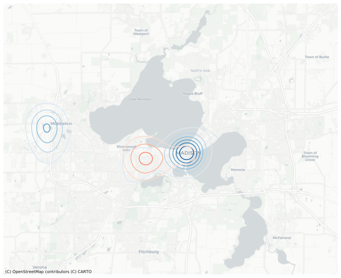
The red and blue contours on the plot above have different scales. To harmonize the scales, we need to compute the levels explicitly and pass them to the function. We can also smooth it out my increasing the resolution from the default (which is 100).
[9]:
mesh = gkde_m.meshgrid(resolution=300, bounds=points, total='TOT')
levels = np.linspace(0, mesh[['A','B']].values.max(), 8)

ax = mesh.contour('A', basemap='CartoDB', figsize=(12,12), levels=levels, cmap='Blues');
mesh.contour('B', ax=ax, figsize=(12,12), levels=levels, cmap='Reds');
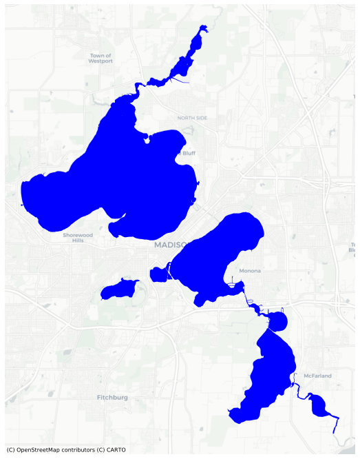
We can mask out lakes if we have a the shape of the lakes. We can use load those shapes from the examples (assuming you have OSMnx installed, to get the shapes from OpenStreetMap).
[10]:
from mapped.example_data import mad_lakes
lakes = mad_lakes()
lakes.plot(basemap='CartoDB', color='blue', figsize=(12,12));
[11]:
mask = np.ones(len(mesh), dtype=bool)
for lake in lakes.geometry:
    mask &= ~mesh.within(lake)
[12]:
mesh.contour(
    'A',
    filled=True,
    alpha=0.5,
    cmap='Blues',
    basemap='CartoDB',
    levels=10,
    figsize=(12,12),
    mask=mask,
);
Plot the relative kernel density of A.
[13]:
ax = mesh.contour(
    'A/TOT',
    filled=True,
    alpha=0.5,
    cmap='Blues',
    basemap='CartoDB',
    levels=10,
    figsize=(12,12),
)

# Also plot the source points by color.
ax = points.query("letter=='A'").plot(ax=ax, color='blue', marker='.')
ax = points.query("letter=='B'").plot(ax=ax, color='red', marker='.');
This is plotting densities across the entire field, but perhaps we only want to plot the densities on land. We can use the same mask as before to plot the relative kernel density of B, masking lakes.
[14]:
ax = mesh.contour(
    'B/TOT',
    filled=True,
    alpha=0.5,
    cmap='Reds',
    basemap='CartoDB.PositronNoLabels',
    levels=10,
    mask=mask,
    figsize=(12,12),
)

# Draw a black border over lakeshores for a cleaner look.
lakes.plot(color="none", edgecolor="black", ax=ax)
mapped.add_basemap(ax=ax, tiles='Stamen.TonerLabels', zoom=11);
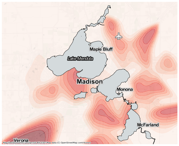
You might notice this relative density is a bit noisy, especially around the map edges where the overall density is quite low. We can add a prior assumption on the relative density, that the baseline probability of each letter is proportional to the global probability, and the observed points are used to measure a deviation from this prior. To do so, we can use the add_prior function of the GeoKernelDensities object. Here we take a copy of the original meash
[15]:
mesh1 = gkde_m.add_prior(mesh, total='TOT')
[16]:
ax = mesh1.contour(
    'B/TOT',
    filled=True,
    alpha=0.5,
    cmap='Reds',
    basemap='CartoDB.PositronNoLabels',
    levels=10,
    mask=mask,
    figsize=(12,12),
)

# Draw a black border over lakeshores for a cleaner look.
lakes.plot(color="none", edgecolor="black", ax=ax)
mapped.add_basemap(ax=ax, tiles='Stamen.TonerLabels', zoom=11);
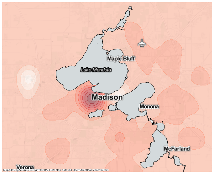
This map doesn’t show the relative density of ‘B’ peaking in Verona, nor bottoming out at zero in the other edges.